The 10 Paint Ideas for Open Living Room and Kitchen
- Local Editor:Local Editor: The HOMEiA Team
Published: Mar 11, 2021
- Category: Home Maintenance , Home Improvement

If you’ve been spending more time than usual in your own home lately—and who hasn’t? — you may be itching to refresh your living space with a new coat of paint.
Here are 10 paint trends for open small living room & kitchen that will help you bring your living room out of the past and into a satisfying future.
Table of Contents:
1. Dark Minerals
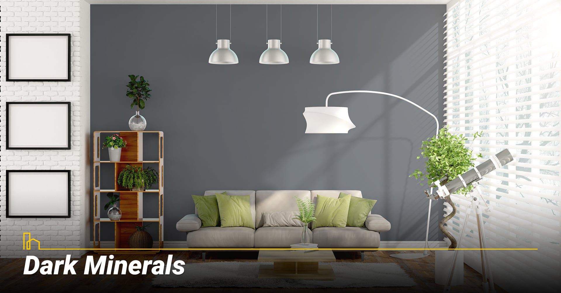
The mineral tones of the moment are deep and rich—think iron and graphite. Colors like these add instant drama to a room. They’ll darken your space, for sure, so make sure that you have ample natural light to offset the walls. By contrast, your furniture and décor will stand out and appear brighter.
These colors can also work in a darker living room—especially one you use mostly in the evening—if you layer your light fixtures (ceiling, floor lamps, accent lighting, task lighting).
Dark tones like charcoal can work with almost any accent color, and they are beautiful with any natural wood tones.
Urbane Bronze is Sherwin-Williams’ Color of the Year for 2021. This deep, rich shadowy gray instantly grounds a room. Simple neutrals like white and beige look like something special with this background, and accent colors from pastels to brights to jewel tones benefit from the contrast.
Other dark mineral paints to try:
- a) Urbane Bronze by Sherwin Williams
- b) Silhouette by Benjamin Moore
- c) Broadway by Behr
- d) Tar by Farrow & Ball
10 Ways to Add Greenery to your Living Room
Big or small, on their own or in groups, plants are a great way to bring nature into your home. Here we’ve gathered ten fresh, creative ideas for bringing greenery into your living room…
2. Wine-Drenched Hues
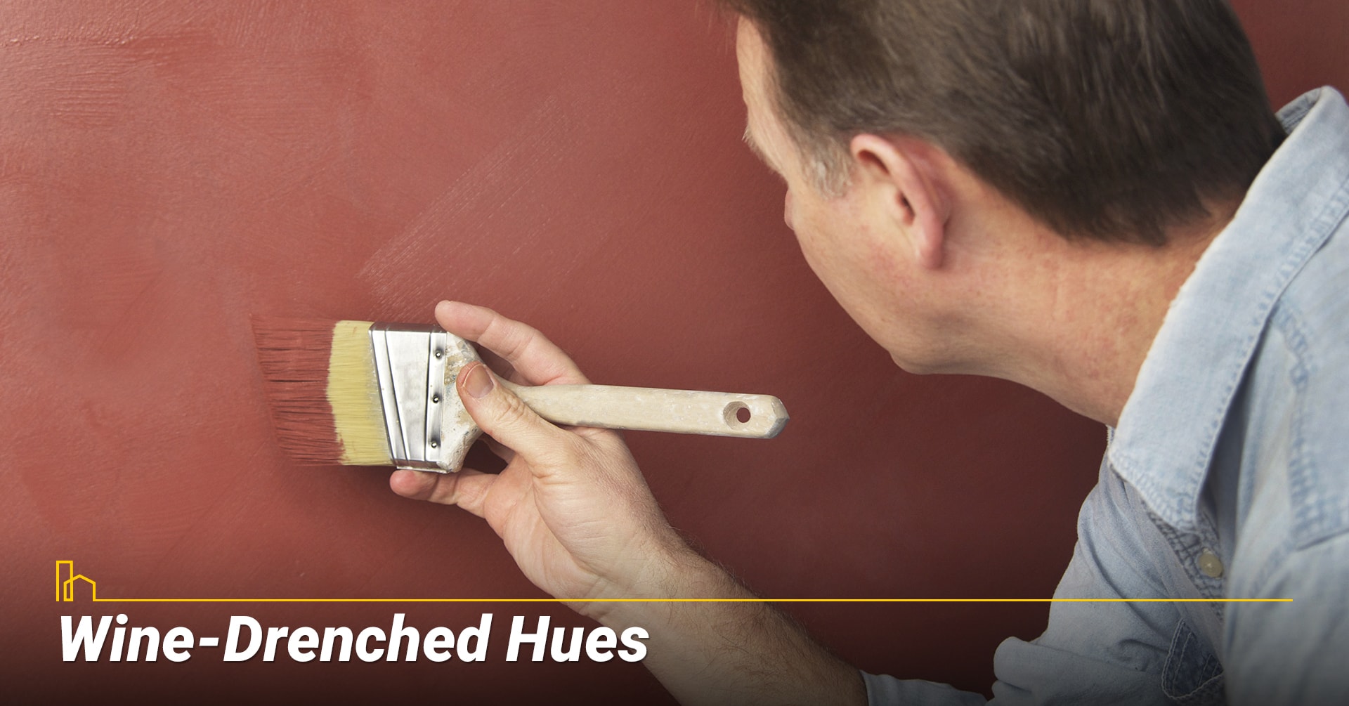
If you enjoy a nice glass of red wine to unwind once in a while, you might take inspiration from the jewellike reds and purples. From Merlot and cabernet to claret and Beaujolais, a rich wine-red living room is instantly warm and welcoming.
HGTV Home by Sherwin-Williams went for a wine tone called Passionate as their 2021 Color of the Year.
It can be hard to find the right shade of wine for your space, so buy samples of your favorites, and of their more muted versions. You may find that, on the walls, the somewhat muddied hues give more of the vineyard effect; truer reds and purples can look more playful and less sophisticated.
Neutrals are an obvious choice to pair with wine; taupes and beiges feel fresh against dark reds and purples. Watch the brown tones, though—make sure the combination is harmonious and the undertones don’t clash.
For more contrast, keep the muted tones and explore ochres and botanical greens.
Some beautiful wine shades to try:
- a) Passionate by HGTV Home by Sherwin-Williams
- b) Epoch by Graham & Brown
- c) Gooseberry by Glidden
- d) Preference Red by Farrow & Ball
Best Interior Wall Colors for Selling a House
Before you put up your property for sale, your realtor might suggest that you repaint the interior walls. Your choice among the various shades of a particular color can have a tremendous impact on the first impressions the house makes on your potential homebuyers, and these impressions can make or break the sale...
3. Peachy and Pale
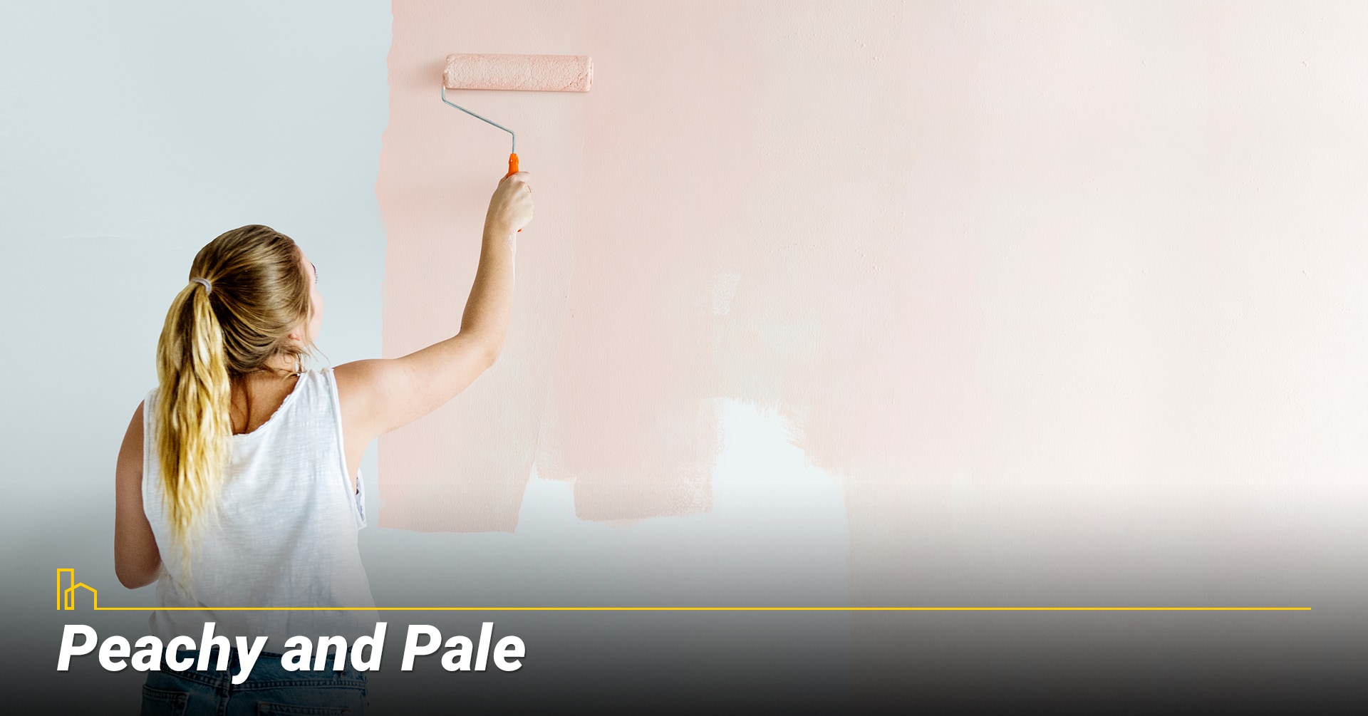
Move over, Millenial Pink. Blush tones are still fresh, but now they’re tending toward the peachy end of the scale.
Peach walls reflect a warm golden tone of light, which can flatter your complexion, just like sunlight at the golden hour. For a great example, check out Peach Squared, which Valspar named among its 12 Colors of the Year for 2021.
Almost neutral, but a bit more sun-kissed, soft peaches make a beautiful background for plants. Try them in rooms with lots of greenery for a sunny and optimistic mood.
Peach also looks great with sun-washed patterns, from stripes to florals.
Some pretty peach paint colors to try:
- a) Peach Squared by Valspar
- b) Pale Apricot by HGTV Home by Sherwin-Williams
- c) Dust of Peach by Pratt & Lambert
- d) Peach Cloud by Benjamin Moore
Recommended for you
4. Misty forests
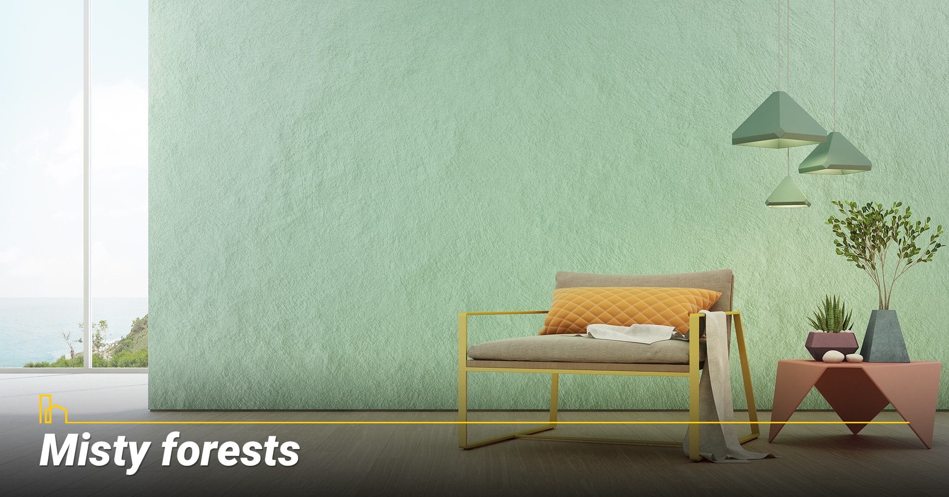
Used alone or in combination, the tones of a misty forest—muddied greens, grayed-out blues, and deep shades like wet bark—bring a sense of serenity to your living space.
The greens of a mossy forest are soft and muddied, with yellow undertones that suggest land rather than sea. Pratt and Lambert’s Color of the Year, Contemplative, fits the bill.
Hushed sky tones combine mid-tone and lighter blues with gray undertones, leaning toward green. They work well with wood, whether stained or natural.
To use blues and greens together, look for colors of similar depth. In the paint store, you’ll find these by looking at horizontal rows of colors, then finding colors near the same position on the paint strip.
Be sure to check your colors in different lighting and against any trim or wood finish in the room; blues and greens can appear quite different in different contexts.
To add eye-catching but still calming contrast, seek out bark-like hues of gray-brown. They will cooperate well with both blues and greens, giving a natural look to a room.
Signs Something Has Gone Wrong with Your Electrical System
Fortunately, it’s not hard to make sure your electrical system stays in tip-top shape. Just pay attention once in a while and notice if there are any signs of trouble. Here’re 9 big signs that your electrical system has a problem—and what to do to keep the problem from growing even…
Colors to try:
- a) Greens:
- Contemplative by Pratt and Lambert
- Jojoba by Behr
- Oakmoss by Sherwin-Williams
- b) Blues:
- Blustery Sky by Sherwin-Williams
- Chalky Blue by Glidden
- Gray Cloud by Benjamin Moore
- c) Browns:
- Center Earth by Behr
- Tanner’s Brown by Farrow & Ball
- Fairview Taupe by Benjamin Moore
What’s Up with 5G for Your Home?
Have you heard? 5G is going to revolutionize everything and launch us into a tech utopia! No, wait—it’s going to mean the downfall of human civilization! Or maybe, like almost every new technology, it will be worse than we hope but better than we fear. So, let’s leave that debate for another day and discuss what you really want to know…
5. Spice Market

At once sunny and earthy, spice tones bring to mind paprika, cayenne, turmeric, saffron, nutmeg, and cinnamon. Decidedly warm with sunbaked yellow undertones, these colors bring energy and autumnal richness to your living room.
While bold, these reds, yellows, and browns are surprisingly versatile. Crisp against white, harmonious with beige, and pleasing combined with each other, you’ll be able to change the look of the room by swapping out a few pillows or an area rug.
Kalahari Sunset, part of Behr’s Color Trends 2021 Palette, is an outstanding example, resembling ground red spices or sun-faded brick.
Spicy paint colors to explore:
- a) Kalahari Sunset by Behr
- b) Saffron Strands by Behr
- c) Reddened Earth by Sherwin-Williams
- d) Tarnished Trumpet by Sherwin-Williams
12 Common Kitchen Layout Mistakes to Avoid
If you intend to stay in your home, but your kitchen doesn’t fit your lifestyle and add enjoyment to the time you spend there, it’s time for a renovation. Updating a kitchen takes a lot of planning, and it’s easy to overlook some crucial things—especially in the layout. Here’s a list of common kitchen layout mistakes and how to avoid them.
6. Barely-There Backdrop
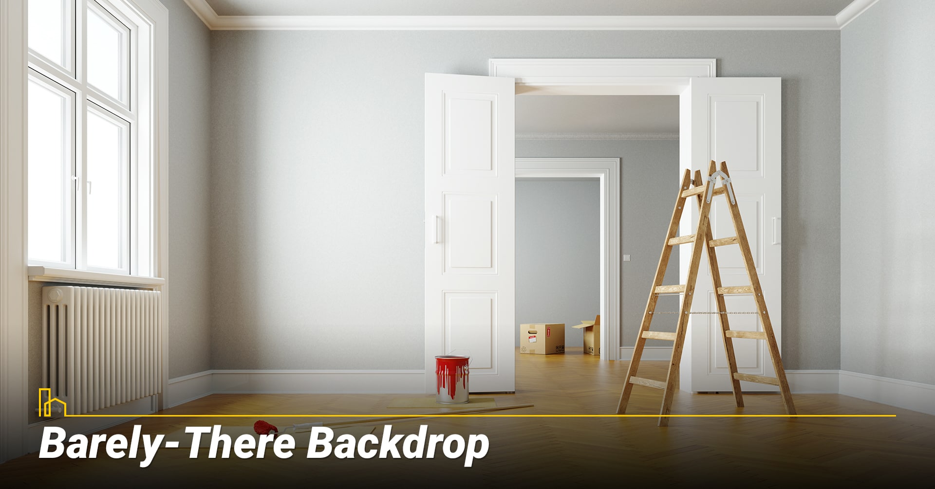
Sometimes you want your paint color to make a statement; other times you want it to recede into the background, taking no attention away from the furnishings or from the action going on in the room. For 2021, you can find that effect in light, true grays.
Pantone’s Color of the Year for 2021 is actually two colors: Ultimate Gray and Illuminating, a bright and shiny yellow. Take inspiration from Pantone and paint your walls with a simple gray shade, then brighten the room with pops of yellow.
Gray can easily read as blue when it appears against browns and wood tones, so choose carefully if blue is not your goal. The best gray may fall flat on a paint chip but will be cool and calm on the walls.
True grays that recede into the background:
- a) Granite Dust by Valspar
- b) Whirlwind by Glidden
- c) Pearl Gray by Sherwin-Williams
- d) Gray Cashmere by Benjamin Moore
Recommended for you
7. Desert Sandstone

If you’ve seen the brilliance of a desert landscape against the bright blue sky—if only on your Instagram feed—you’ll understand why earthy colors make the list for 2021.
Behr’s Color of the Year is Canyon Dusk, a warmed-up, rich sand color that recalls places like Arches National Park.
PPG, too, chose a desert sand shade—called Transcend—for the top of their list in 2021.
What can you put with sand-colored walls? Virtually anything. Add a beachy twist with oceanic blues, surround yourself in peaceful neutrals with white, or bring in brights that remind you of your favorite travel destination. It’s hard to go wrong.
Splendidly sandy paint colors:
- a) Canyon Dusk by Behr
- b) Transcend by PPG
- c) Potters Clay by Benjamin Moore
- d) Faded Terracotta by Farrow & Ball
How to Raise Your Home’s Value with Bathroom Renovations
Bathroom renovations are an excellent way to add value to your home. As with any remodeling project, however, you can’t expect to recoup the entire cost of the project when you sell. Remodel Magazine puts the expected value of a midrange bathroom redo at 64 percent of the price tag. If you should happen to sell the house in the future, you’ll…
8. Sea Spray in Sunshine
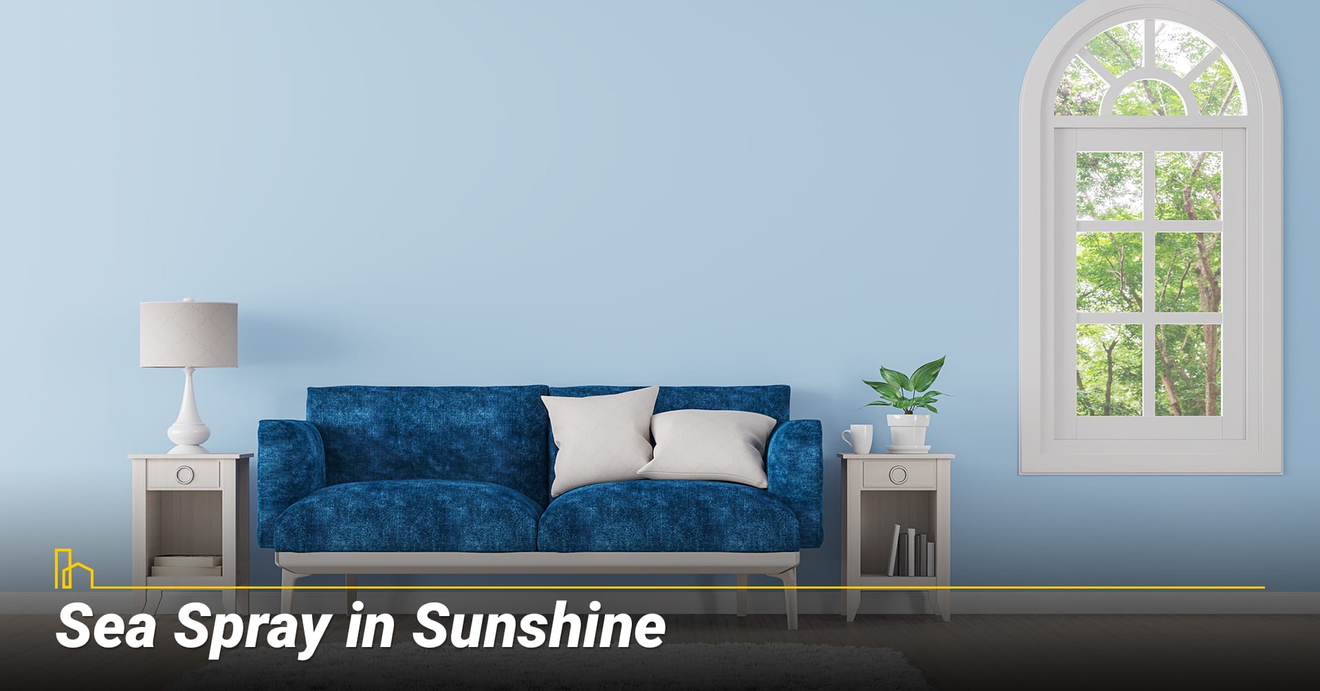
While some homeowners are craving calming, steady neutrals right now, others are more than ready for a change to something bold and optimistic. If you’re one of them, look to the colors of the sea on a sunny day.
Turquoises and aquas are vibrant and brilliant and bring life to any room. Use them as accents in a more neutral space or surround yourself with their watery hues for a more immersive experience.
Benjamin Moore has named Aegean Teal as its Color of the Year for 2021. Use this fresh and serene blue-green with crisp whites and pale woods for a gentle, clean feeling.
Oceanic blue-greens to try:
- a) Aegean Teal by Benjamin Moore
- b) Misty Aqua by PPG
- c) Aqua Fiesta by Glidden
- d) Swimming by Sherwin-Williams
The Best 10 Ways to Maintain Your House
Your house is most likely the most expensive purchase of your lifetime — and a safe haven that provides a hub for everyday activities, relaxation and making memories. It doesn’t remain in great shape without some effort, but with some loving care and an organized maintenance schedule, you can manage the upkeep without added stress…
9. Forever White
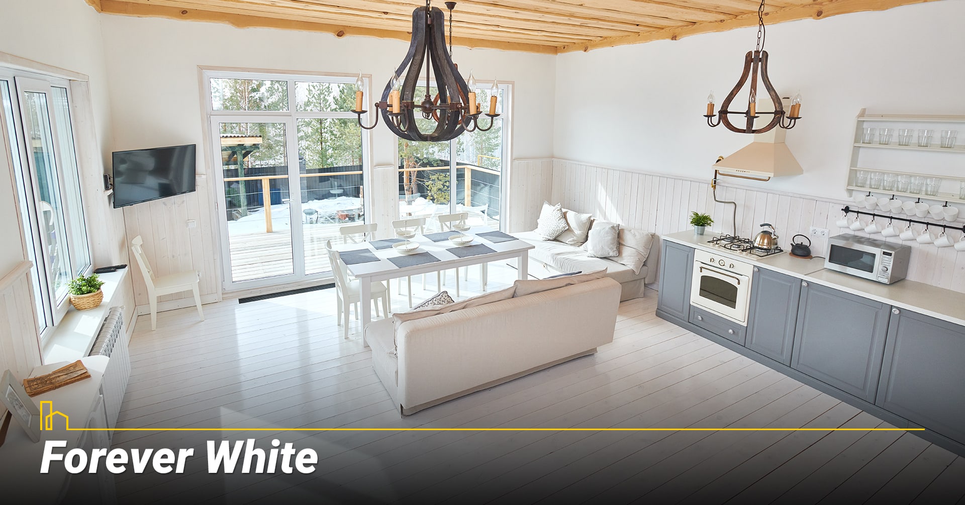
Chalky white walls have been in the spotlight for some time now, but even as this trend fades white will remain popular; it never truly goes away.
The whites of the moment have an aged appearance, reminiscent of monuments and old farmhouses—there’s a certain patina that gives them gravitas and maturity.
Whites to try:
- a) Atrium White by Benjamin Moore
- b) Alabaster by Sherwin-Williams
- c) Old White by Farrow & Ball
- d) Smoky White by Behr
Recommended for you
10. Pleasing Florals
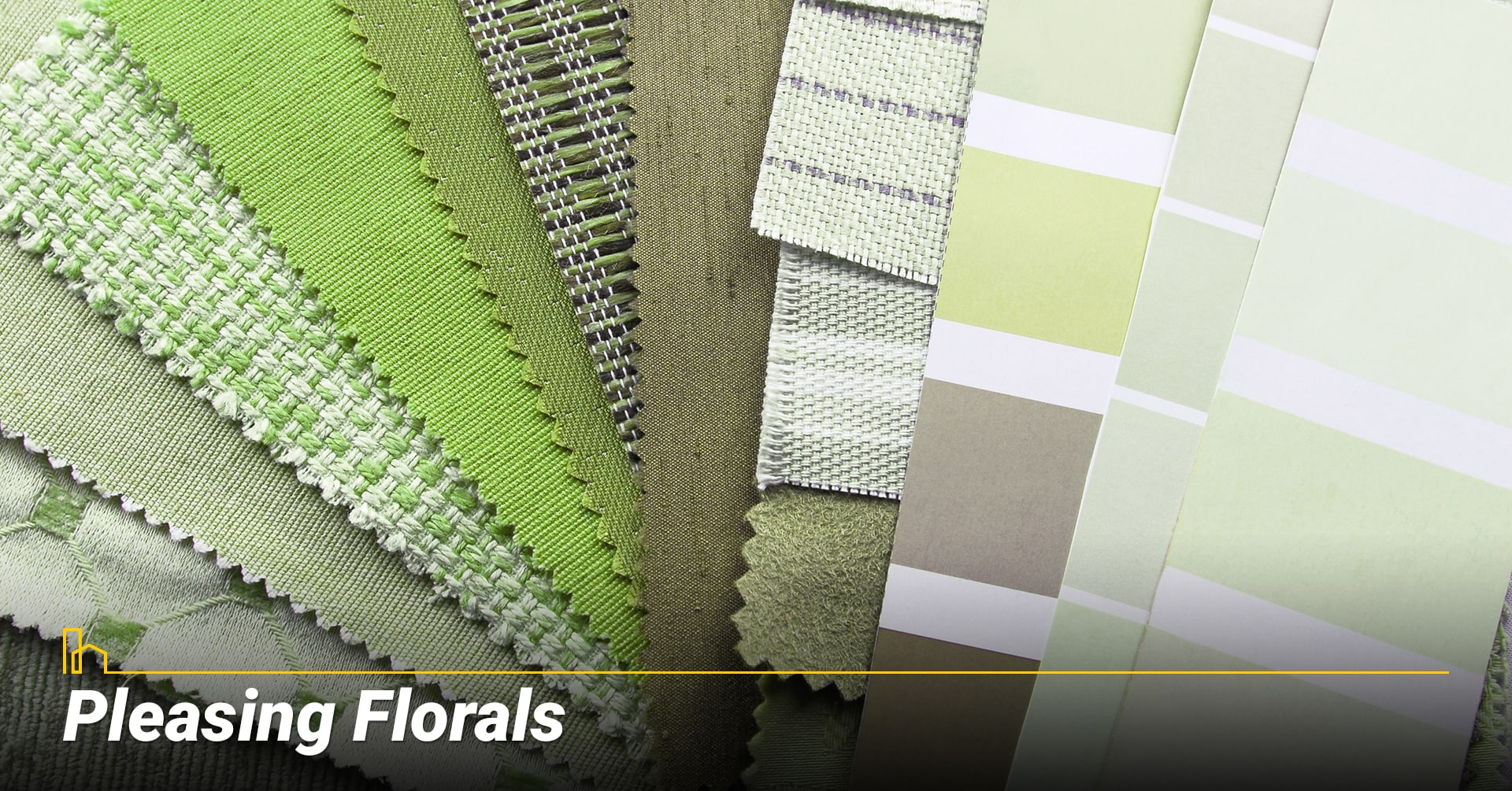
Resplendent with springtime energy, these hues aren’t quite pastels—they’re a bit more saturated and mature. Rose pink, dandelion yellow, and crocus purple feel new and optimistic after a dark winter.
Sherwin-Williams’ 2021 Tapestry collection features several of these daring colors. Use them sparingly as accents or go bold and splash them everywhere for a room that really stands out.
- a) Jaipur Pink by Sherwin Williams
- b) Euphoric Magenta by Behr
- c) Citrona by Farrow & Ball
- d) Magenta by Glidden
Whether you’re in need of a big change or just a minor refresh, new paint on the walls of your living room can be one of the best ways to bring change to a home that’s feeling stale. Which color will you choose?
We hope you find this article helpful. If you do, please share it on your Facebook page so other can benefit from it as well. Thank you in advance!
How to Deal with a Mold Problem in Your House
When you have a leaking pipe within the walls, mold may also form in its vicinity. Even a leaky roof can lead to mold formation on your ceiling and the wall directly underneath the leak. Here is how to identify and remove mold from your house…
HOMEiA is a city guide site where visitors can find detailed information about communities of interest. HOMEiA’s City Guides, created in partnership with local writers and editors, are curated lists of the best, safest, and most affordable places to live. The guides feature the HOMEiA Score, a proprietary index that rates communities on such factors as housing costs, education, employment, etc.
HOMEiA.com aims to be the premier site for people planning to relocate, providing them with insightful content and connecting them with skilled real estate professionals.
We also empower real estate professionals to establish or strengthen their web presence by highlighting their experience, knowledge and achievements. If you’re selected to join our list of certified real estate professionals, you will distinguish yourself from your peers — and earn HOMEiA’s support.
If you believe in HOMEiA’s mission, please share our website with others.


